Neutrino
Neutrino
Ecommerce Website
My role - UX/UI Design
My role - UX/UI Design
2022
2022
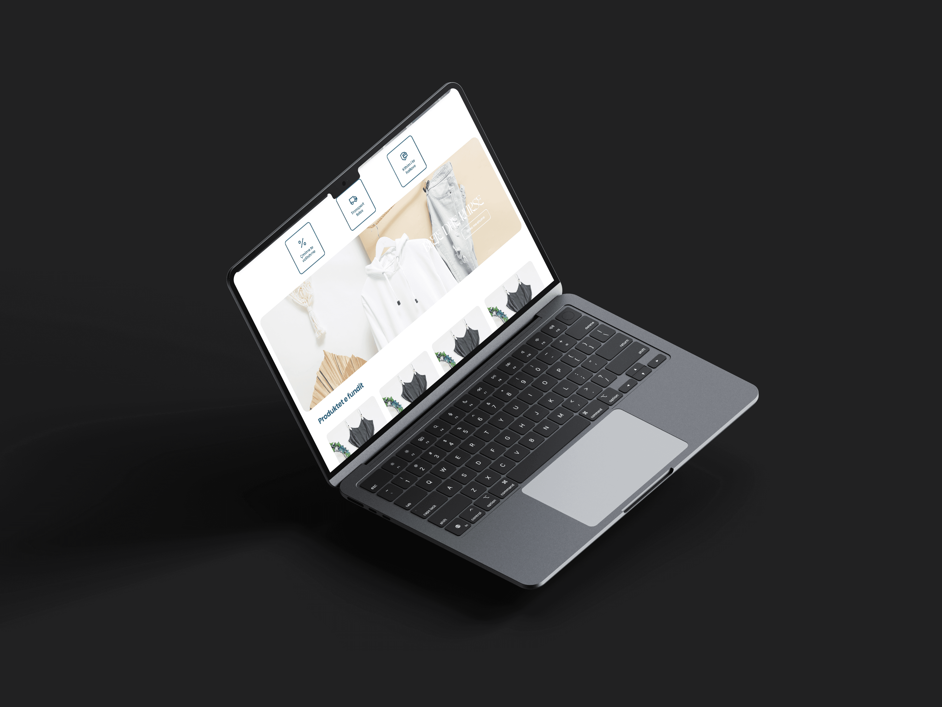
Project Overview
Project Overview
In this case study, I detail my collaboration with Neutrino, a renowned bridal dress company celebrated for its exquisite wedding attire. The challenge was to design an e-commerce website that not only showcased their dresses but also provided a seamless and emotionally resonant shopping experience for brides-to-be. To tackle this task, I conducted thorough research to understand modern brides' preferences. I developed a solution prioritizing user-friendly navigation, captivating product displays, and a secure checkout process. The design journey encompassed wireframing, visual design, and responsive layout implementation.
In this case study, I detail my collaboration with Neutrino, a renowned bridal dress company celebrated for its exquisite wedding attire. The challenge was to design an e-commerce website that not only showcased their dresses but also provided a seamless and emotionally resonant shopping experience for brides-to-be. To tackle this task, I conducted thorough research to understand modern brides' preferences. I developed a solution prioritizing user-friendly navigation, captivating product displays, and a secure checkout process. The design journey encompassed wireframing, visual design, and responsive layout implementation.
Problem
Problem
Despite the successful creation of a visually appealing and user-friendly website, Neutrino is experiencing lower-than-expected conversion rates. While the website effectively showcases their bridal dress collection, it is not achieving the desired level of sales and engagement with potential customers.
Design process
Design process
With unwavering attention to detail, I gained a deep understanding of users, their needs, and the design's problem-solving mission.
With unwavering attention to detail, I gained a deep understanding of users, their needs, and the design's problem-solving mission.
The harmony between UI and UX serves as the bedrock of the design process, guaranteeing the final product meets user needs and expectations convincingly.
The harmony between UI and UX serves as the bedrock of the design process, guaranteeing the final product meets user needs and expectations convincingly.
Discovery
Discovery
I gathered information and insights about the user, their needs, and the problem that the design aims to solve. Additionally, I analyzed the domain and competitors, conducting user interviews to gather valuable input
I gathered information and insights about the user, their needs, and the problem that the design aims to solve. Additionally, I analyzed the domain and competitors, conducting user interviews to gather valuable input
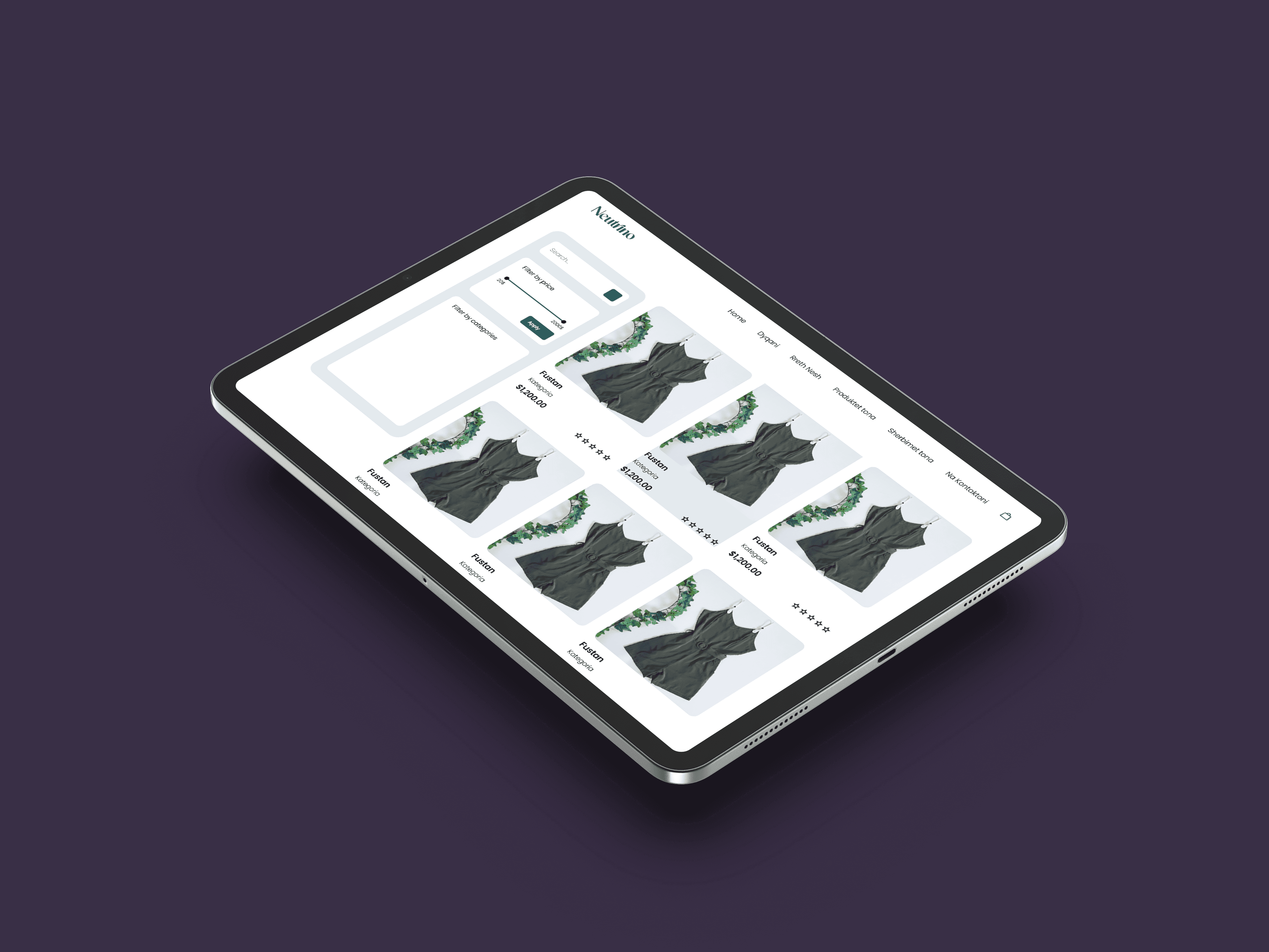
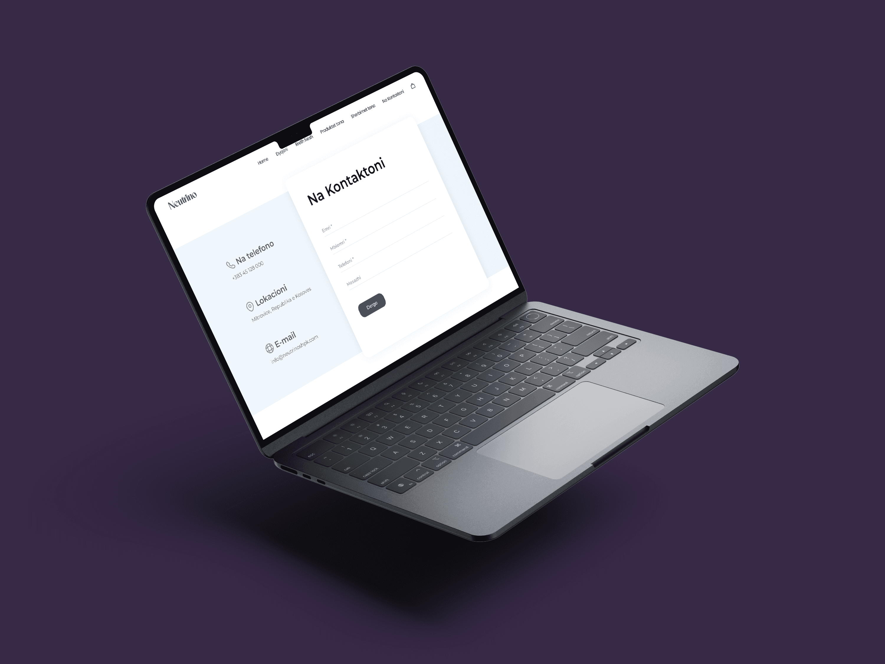
User Interface
User Interface
Visual design held a crucial place in my consideration, recognizing the signficance of a well-balanced UX and UI. With the user at the forefront, I crafted a simple yet captivating design.
Visual design held a crucial place in my consideration, recognizing the signficance of a well-balanced UX and UI. With the user at the forefront, I crafted a simple yet captivating design.
User Experience
User Experience
Beginning with informational architecture, I delved into app structure comprehension, prioritizing an optimal user experience. Subsequently, I embarked on crafting both Low and High-Fidelity wireframes
Beginning with informational architecture, I delved into app structure comprehension, prioritizing an optimal user experience. Subsequently, I embarked on crafting both Low and High-Fidelity wireframes
Typeface
Typeface
Readable, versatile and modern aesthetic font.
Readable, versatile and modern aesthetic font.
Poppins - an excellent fit for interfaces that require easy reading of text, such as in user interface and digital.
Poppins - an excellent fit for interfaces that require easy reading of text, such as in user interface and digital.
Colors
Colors
Choosing 3 primary colors helped to create a visually appealing, easy-to-use, and accessible design.
Choosing 3 primary colors helped to create a visually appealing, easy-to-use, and accessible design.
By choosing a small number of primary colors, we ensured that the app has a consistent look and feel across all screens and functions.
By choosing a small number of primary colors, we ensured that the app has a consistent look and feel across all screens and functions.
#1B4B66
#FFFFFF